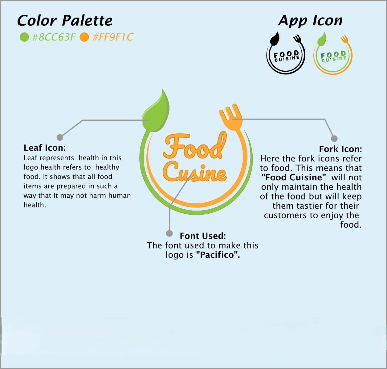
A hand-lettered wordmark and icon system for a food & restaurant brand, built around a leaf-and-fork symbol that reads "healthy" and "tasty" at once.
Food Cuisine needed a mark that could say "healthy" and "delicious" in the same breath — friendly enough for a food brand, distinct enough to hold up as a small app icon.
We built the wordmark in a hand-lettered Pacifico script, wrapped it in a leaf-and-fork ring — the leaf standing in for health, the fork for taste — and set it in a green-and-orange palette that carries cleanly into a simplified app icon.
See the full list of branding, website development and on-page SEO work.
VIEW ALL PROJECTSEvery project starts with a free consultation to understand your business and map out what your brand identity actually needs to do for you.